Responsive Web Design London
Motive of Responsive Web Design London
Motive of Responsive web design London is all about making all the web pages on your site compatible with different mobile devices and internet browsers. No matter where your responsive website is accessed from, it will display in an appropriate manner.


What Do We Do for Responsive Web Design?
Ensure Accessible Viewport
Conduct a thorough inspection of the viewport to validate that it is in good working order. By using viewport tags in meta tags, it helps pages to adjust any kinds of screen resolution.
Size Content to the Viewport
Images:- Images will be added with the “max-width: 100%” tags to fit the images resolutions and never get in trouble with images response design.
Layout:- This is another biggest element in responsive design. Because, without layout percentage element web pages will be floated on screen. So, we make sure your website works in any kinds of screen resolutions.
Use CSS Media Queries for Responsiveness
Media queries based on viewport size:- In order to modify the presentation of a website for different screen sizes, media queries may be used as a basic filter. They make it simple to adapt visual presentation to the capabilities and constraints of the device producing the content, such as the viewport’s width and height, the user’s ability to zoom in and out, the presence or absence of a mouse cursor, and whether or not the user is using a touchscreen.
To do this we have to include a print style according to google web.dev recommendations to achieve that responsiveness.
Media queries based on device capability:- By using any-hover and any-pointer tag we make sure that your website will give best performance on any kind of device. Just like Touch screen to a non touch screen.
Choosing Breakpoints
Breakpoints are important things to define layouts for each specific device or product. But if you do that individually for each, it will be a great hassle to maintain. So websites should define his Layout breakpoint itself to adjust the container.
Picking major breakpoints, tiny to big:- We will design and define each breakpoint from small screen size to adjusting larger display. And fix the dimensions of the context width min-max attribute.
Optimize text for reading:- We optimize text by following Google’s recommendation and that includes breakpoints after 8 to 10 words.

Why Do You Need Responsive Web Design?
If your website looks good on any screen size, it will likely convert your visitors to potential customers. Moreover-
- Interface flexibility: All elements are rendered smoothly, content moves freely on the screen according to its size, while maintaining its original style.
- Friendliness: It doesn’t need to search the scroll bar on blocks or flip the device to view all content.
- Save money and time: If you create separate desktop and mobile versions of the site and then engage in SEO promotion for them separately, that’s an extra expense in terms of budget and time.
- Improved site ranking in Google: One of the criteria by which a search engine promotes sites in organic search results is the adaptability of their design.
Why Does Google Prefer Responsive Design?

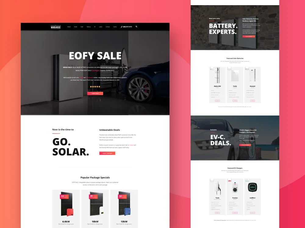
Want to See a Sample of Responsive Design Websites?
Our Latest Projects
We’ve created functional, aesthetic, and engaging websites that not only tell your story beautifully but are also very easy to use & customize.
What Our Clients Say
Gigabit offers a wide range of web services. From website design and development to online marketing, they have the expertise and experience you need. Highly recommended!

Gigabit is the best web design and development company in town. They are very professional, knowledgeable, and offer a wide variety of services for your business needs.

Gigabit is a web design and development company. They have a team of professional who are experts in the field, and they're ready to tackle any project you can throw at them!

Great company and we love their work!

Frequently Asked Questions
Responsive Design Layout Yourself - is It Possible?
This is possible if you are proficient in working with HTML, CSS, c website builders, and other software. It takes time, skill, and experience. It is better to entrust such difficult work to professionals.
How to Make Responsive Website Design Cheaper?
How Much Does It Cost to Develop Responsive Design?
Why is Responsive Web Design So Important?
What is Responsive Flow Design?
I'm a Newbie Entrepreneur; What Are the Benefits of Developing a Responsive Website Design?
Why Do Web Designers So Widely Use Responsive Design?
Related Services

WordPress Development
WooCommerce Development