Web Design & Development

Gigabit’s 6 years of responsive web design services knowledge ensures a smooth user experience, a mobile-friendly website, good SERP rankings, and a greater conversion rate.

Responsive Web Design Services
Responsive Web Design Service By Gigabit

Captivate Audiences with a Stellar Online Presence!

Elevate your digital presence with our Web Design & Development expertise. We specialize in crafting visually compelling and functionally robust websites that seamlessly integrate cutting-edge technology. From conceptualization to execution, our team ensures precision and creativity in every detail, tailoring online experiences to meet your unique needs. Whether you’re a startup aiming for a striking debut or an established brand seeking a refreshed online identity, our services guarantee a seamless blend of innovation and aesthetics. With a focus on responsive design, we ensure optimal performance across devices, delivering a captivating and user-friendly digital journey for your audience.

Our Web Design Development Services

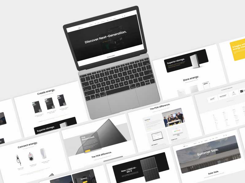
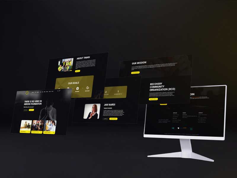
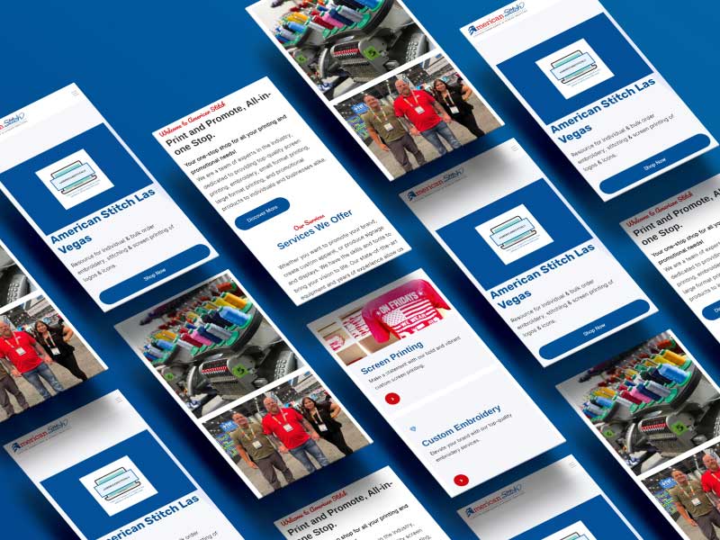
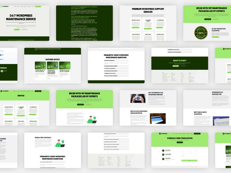
Front-end Development

Gigabit crafts captivating front-end solutions, delivering seamless user experiences with creativity, precision, and cutting-edge technologies.

Back-end Development

Empower your digital core with Gigabit's Back-End Development. Robust, scalable solutions fueling seamless functionality and growth.
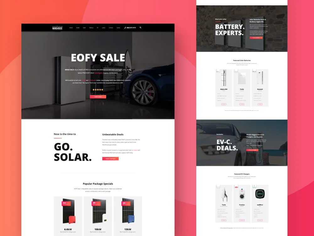
CMS Solutions

Gigabit's CMS solutions streamline content management, fostering efficiency, flexibility, and dynamic digital experiences for businesses.

SEO Optimization

Gigabit maximizes online visibility through strategic SEO optimization, enhancing rankings and driving organic traffic growth.

Fastest Loading Speed

Gigabit ensures the fastest loading speed, optimizing performance for a seamless and responsive user experience.

Website Maintenance

Trust Gigabit for reliable website maintenance, ensuring optimal performance, security, and a seamless user experience.

Web Design & Development Working Process

Requirements Analysis

We began our work by thoroughly evaluating your specific needs for designing your site.

Design

Then we create a visual layout for the website and select appropriate graphics and fonts.

Development

After the website's design phase has been completed, the website development process will begin.

Testing & Deployment

Finally, we test the website so that it works as expected and then host it on the web server.

Our Latest Projects

We’ve created functional, aesthetic, and engaging websites that not only tell your story beautifully but are also very easy to use & customize.

Perth Solar Warehouse

Perth Solar Warehouse

PSW Energy

There Is No Hero In Heroin

American Stitch

Wp Ministry

Solar Analytica

Solar Analytica

Would you prefer to talk to someone?

Ready to start a project or really curious about our process? Drop us a note or give us a call (901) 249-0909; we’re happy to answer all your questions.

Modern Full-stack, Delivering Top-tier Performance.

Our team of web design experts has meticulously selected the optimal tech stack for top-tier application quality and performance.

What Our Clients Say

Frequently Asked Question

Responsive web design is a design approach that aims to make web pages look good on all devices, including desktop computers, tablets, and smartphones. Responsive web design aims to have a single HTML codebase that can be used to display a website on any device, with the layout and content automatically adjusting to fit the size and orientation of the screen. This helps ensure that users have a consistent experience when accessing a website from different devices and helps to prevent the need for a separate mobile version.

Responsive web design makes all views on your website, such as mobile and tablet. It also makes sure that your website looks great on different screen resolutions. Another important aspect is that it guarantees a great performance in terms of speed, page load and more.

To know whether your website is mobile-friendly or not, take the following steps:
Open your website in a browser.

First, take your cursor along the right edge of the browser window, and resize the window down to the size of a mobile phone display.

If the layout changes based on your screen size, that indicates your site is responsive.
If the content on the right side gets hidden instead of being resized, your website is adaptive but not responsive.

When your content and site is not mobile responsive, you are losing out on a large part of your audience. There are many different ways to be mobile responsive without making major design changes, Gigabit helps you with these solutions. A website that is not mobile responsive has less chances of having higher rankings and referrals than a responsive one.

Sure you can. Our unique service that relies on the latest technology is what sets us at the top. You will be dealing with highly skilled professionals, and any issues you encounter will always be resolved promptly to ensure your work meets the standards you deserve.

For your inner peace, you can review our work, and if you are satisfied with what we have done, that is all that matters.

This site uses cookies. By continuing to use this website, you agree to their use. For details, please check our Privacy Policy.